
Qualitative & Quantitative Product Research,
Qualitative & Quantitative Product Research,
— CATEGORIES
UX Research
UX Design
Information Architecture
Data Analysis
— METHODS
Heuristic evaluation, competitive and comparative feature analysis, user flow documentation, card sorting, sitemap documentation, navigation redesign and usability testing
— TOOLS
Figma
Adobe Illustrator
InVision
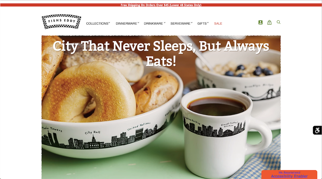
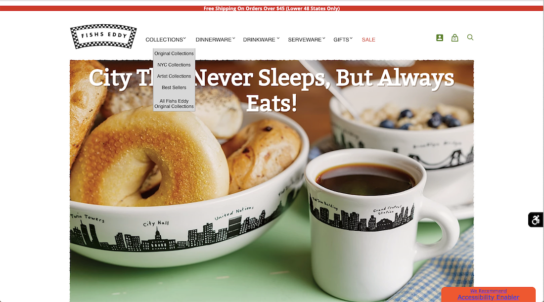
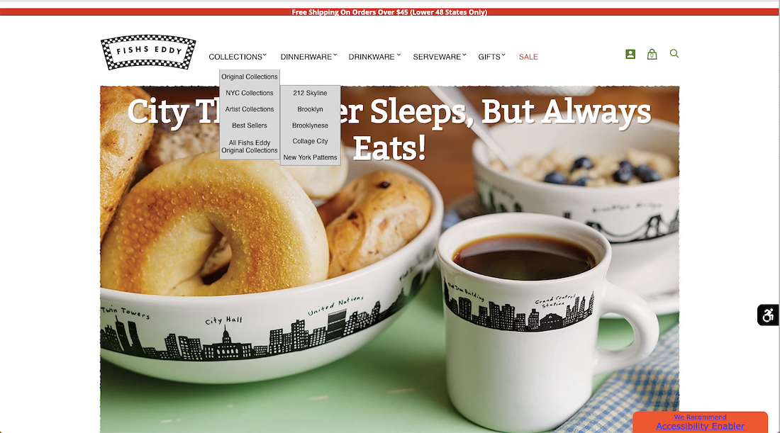
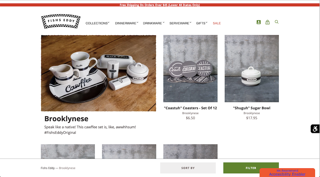
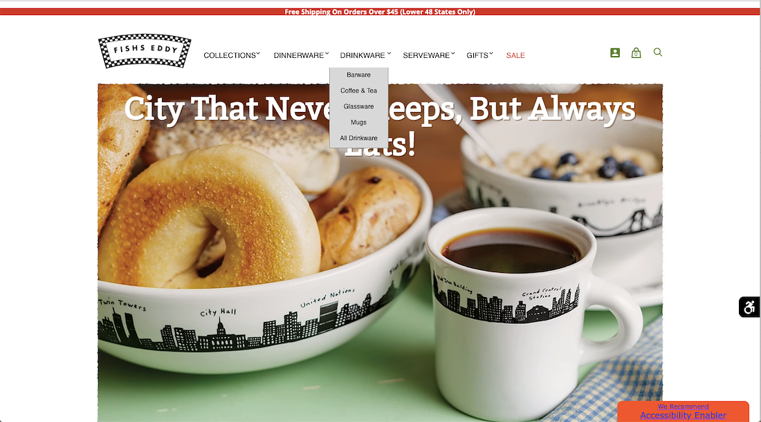
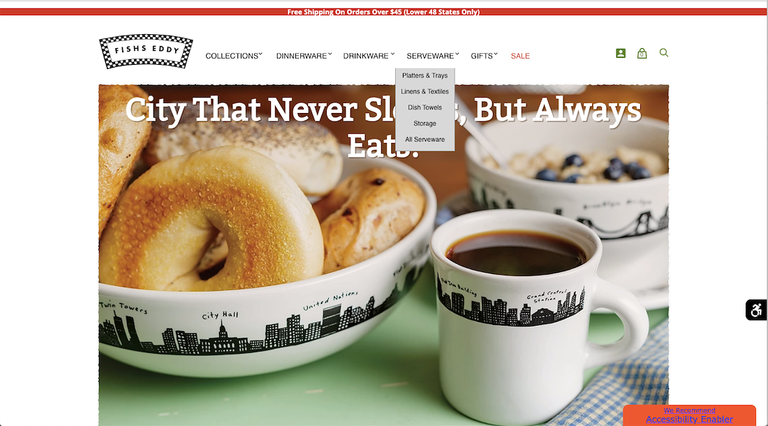
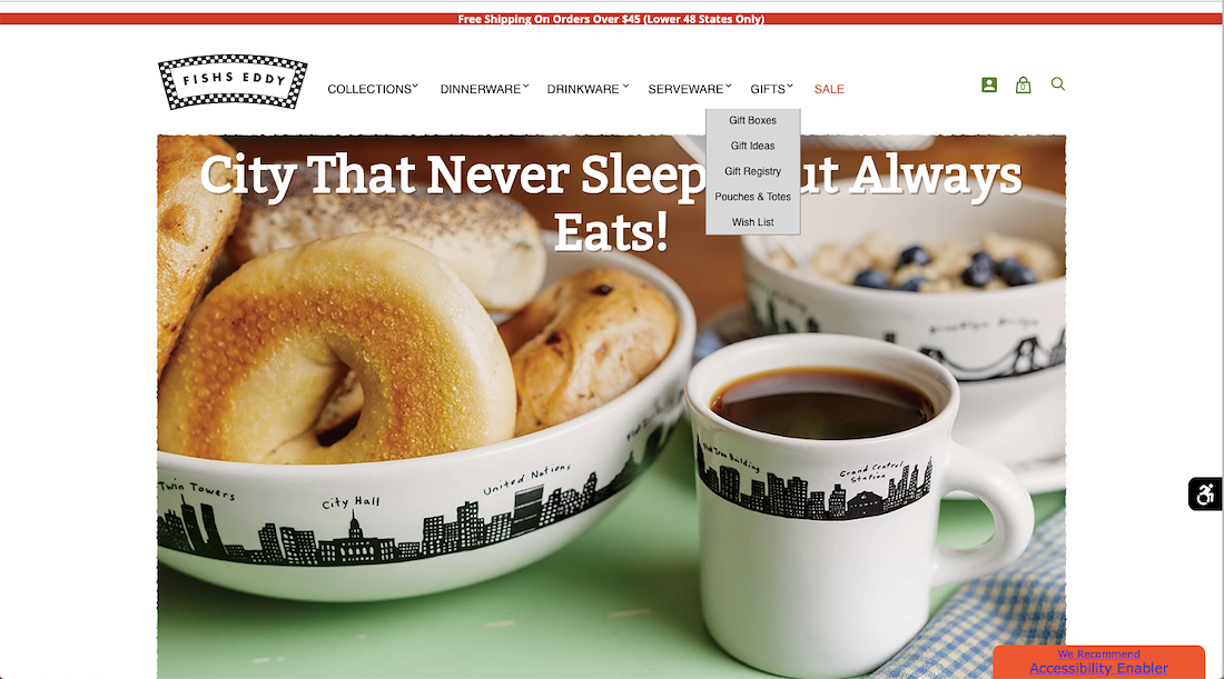
PROBLEM: Whether its a set of vintage plates from a 1920s steamship, a juice glass from a jazz age hotel, or a bowl with the New York skyline, Fishs Eddy products are distinctive. That paired with a large amount of options in has left their online stores navigation difficult for users to find and purchase products.
SOLUTION: Analyzing the information architecture of the existing product to assess the usability and functionality of Fishs Eddy's desktop website and its competitors. Using those finding redesigning the primary and secondary navigation bars leading to an improved user experience.

Heuristic
Evaluation
Beginning the evaluative process by visiting the existing Fishs Eddy website to identify opportunity areas, primarily looking to understand the site’s organization, labeling, navigation, and search functionality.
What Fishs Eddy does well
• Present and easy to contact staff for customer support
Areas for improvement
•Ability to save information for future purchases
•Consistency in page response
Card Sorting
Documentation
In compiling the data from my card sorts my key takeaways weren’t so much in the numbers as I note that quantitative data at numbers as low as such yield inconclusive data. What I did gather in a qualitative form was the seeing the users struggle with many of the cards and often not know where they even wanted to place them in an open or closed setting. Titles such as “Hello Dolly” when presented on their own outside of a category meant little. I found that this being the case grouping the original collections under “Collections” would be my first step and then sorting those collections into “NYC Collections” as that was my #1 finding that i was able to pull from my data. Aside from that the groupings listed as “dine”, “Drink” “serve” etc left users unsure what type of site they were visiting. That said, The addition of the “-ware” extension was added. Based off my findings not only in the card data, but also in the company sites breadcrumbs. Aside from the Primary Menu all of the categories were listed as “-wares” So In my prototype I was able to address that as well. SO. My key findings were that I should:
That Said, in moving forward far more card sorting would be in order for maximizing the usability of the secondary navigation items.


/background(fff)/1920x3200.jpeg?auto=webp)
/background(fff)/1920x3200.jpeg?auto=webp)
/background(fff)/1920x1483.jpeg?auto=webp)
/background(fff)/1920x2484.jpeg?auto=webp)